First, navigate to the Generated Report Window. You can do this by running the report you wish to turn into a chart.
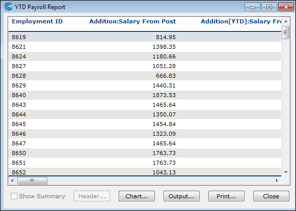
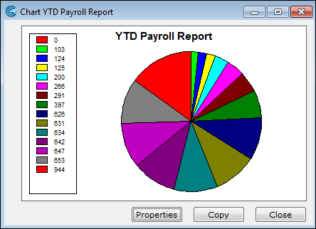
Once your report is displayed, look for the Chart button and click on it. This action will open the Chart Report window.
In the Chart Report window, click on the Properties button. This will bring up the Chart Properties criteria, where you can customize your chart:
Select a Style: Choose a style for your chart. This will determine the overall look and feel of your chart.
Define the Category (X Axis): Select the field you want to use as the Category, which will be displayed along the X-axis of your chart.
Choose the Values (Y Axis): Select one or more fields to represent the Values, which will be plotted along the Y-axis.
Click the OK button. The chart is created.
How do I turn a report into a chart?
- Published on Jun 10, 2026
- 1 minute(s) read
- RH
- SG
Was this article helpful?